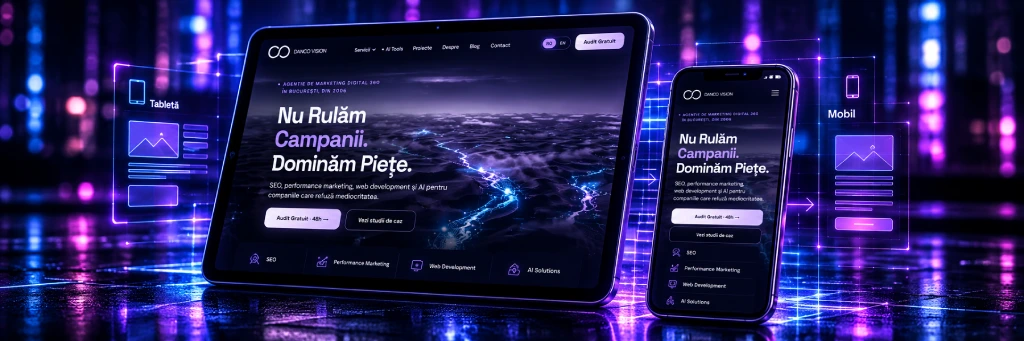
A website can look great on desktop and, yet, be difficult to use on a phone. Text that is too small, buttons that are hard to tap, complicated menus, or forms that do not fit on the screen are issues that can cause visitors to leave the page before completing a conversion.
That is why web design adapted for mobile and tablet is no longer just an aesthetic option. It is an important component of user experience, technical performance, and SEO strategy.
At Danco Vision, web development projects aim to combine design, functionality, and commercial goals. A website must be easy to navigate and use, regardless of screen size.
What does web design adapted for mobile and tablet mean?
Web design adapted for mobile and tablet involves creating an interface that adjusts to different screen sizes and orientations, keeping content accessible and functionalities easy to use.
The most well-known approach is responsive design, where the page structure automatically reorganizes based on the available space.
For example, a website can display three product columns on desktop, two on a tablet, and just one on a mobile phone. The main menu can become compact, and images and buttons can adjust their sizes to remain easy to use.
Importantly, adaptation should not be limited to shrinking elements. Content must be prioritized, and interactions must be designed for each type of device.
Why does a responsive website matter for your business?
A website optimized for mobile devices directly influences the way users interact with your brand.
The main benefits are:
Simpler navigation: menus, buttons, and forms remain accessible even on small screens.
- Consistent experience: users can access the same information and functionalities from desktop, tablet, or phone.
- Fewer conversion obstacles: forms and checkout processes can be completed more easily.
- Efficient management: a responsive website can use the same content structure across multiple devices.
- SEO compatibility: a well-implemented mobile experience supports accessibility and the proper use of pages by Google.
These advantages are relevant both for presentation websites and for online stores or complex digital platforms.
How is web design adapted for mobile and tablet created?
A responsive project involves more than choosing a template. The result depends on how the interface, development, and testing are planned.
1. Analysis of users and objectives
The first step is understanding how visitors use the website.
For an online store, priorities may include product search, filters, and checkout completion. For a service website, the focus may fall on presenting the offer, contact forms, and quick access to essential information.
This analysis is also relevant for web apps projects, where users frequently interact with more complex functionalities than those of a typical website.
2. Organizing content for different screens
On mobile, available space is limited. Therefore, important information must be visible without the user navigating through complicated structures.
Headlines, images, menus, and buttons are organized so that the page remains clear. Secondary elements can be repositioned or grouped without removing necessary information.
3. Developing and adapting the interface
At this stage, flexible structures, adaptive images, and display rules for different screen sizes are implemented.
The correct functioning of interactive elements is also ensured: menus, forms, filters, buttons, and dynamic components.
4. Testing on devices and browsers
A website should not only be checked by resizing the browser window.
Testing must include phones and tablets of different sizes, vertical and horizontal orientation, relevant browsers, and touch interactions.
This makes it possible to identify issues such as overlapping elements, cut-off content, or buttons that are difficult to use.
The Role of UX/UI in Responsive Web Design
A website can be technically responsive, yet offer a poor experience.
For example, a form that fits on the screen is not necessarily easy to fill out. If it has too many fields, unclear instructions, or buttons that are hard to identify, the user may give up.
This is where UX UI design comes into play, focusing on both the organization of the user experience and the visual presentation of the interface.
In a project for mobile and tablet, the following are important:
- the size and spacing between interactive elements;
- text readability and color contrast;
- menu structure and navigation clarity; the simplification of forms and conversion processes;
- accessibility for users with different needs.
At Danco Vision, integrating UX/UI and web development expertise allows addressing these aspects right from the design stage, not just through subsequent corrections.
What is the connection between responsive design and SEO?
Google predominantly uses the mobile version of a website's content for indexing, through the mobile-first indexing system.
Therefore, it is important that the mobile version provides access to essential content, internal links, and information relevant to search engines.
However, a responsive website does not automatically achieve better rankings in Google. Organic visibility also depends on content quality, technical structure, page relevance, and other factors.
From a technical SEO perspective, the following are particularly worth monitoring:
- Core Web Vitals: indicators such as LCP, INP, and CLS, which reflect aspects of loading, interactivity, and visual stability.
- Image performance: adapted dimensions, efficient formats, and optimized loading.
- Content accessibility: readable texts and elements that do not hinder navigation.
- Mobile functionality: avoiding display errors and inaccessible features.
A correct approach to responsive design must, therefore, be correlated with technical development and SEO optimization.
Why choose Danco Vision for developing a responsive website?
Danco Vision has been active in digital marketing since 2006 and offers web development, UX/UI, SEO, and performance marketing services.
For companies that need a new website or an update to an existing one, this combination of skills allows the project to be analyzed from multiple perspectives.
A website must look good, but also support concrete goals: quote requests, sales, appointments, or other relevant interactions.
That is why interface development can be aligned with SEO structure, user experience, and the requirements of digital campaigns.
Depending on the project, Danco Vision can evaluate mobile and tablet adaptation needs and propose development solutions tailored to the platform and the company's goals.